
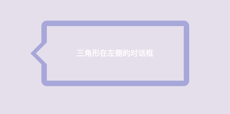
我们先说一下这个描边三角形 + 描边矩形的气泡对话框实现的思路:
①设置矩形带边框 描边 ;
②添加伪元素before ;
在里面添加一个实心的三角形A (颜色为矩形边框色)
③添加伪元素after;
在实心的三角形A上添加一个小三角形B (颜色为矩形背景色),将A覆盖,只留两个边
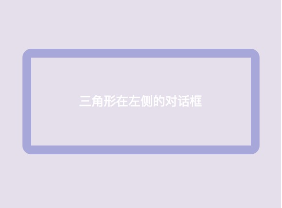
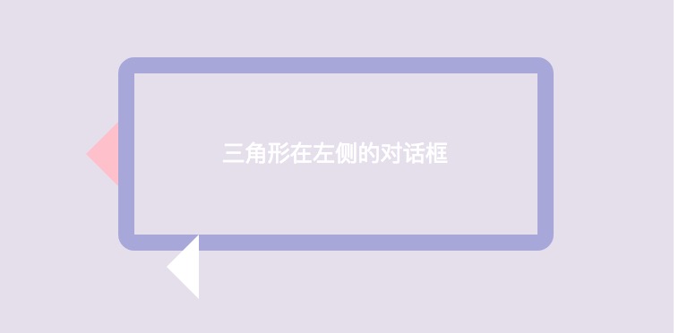
一、绘制矩形对话框
在绘制如上图这样一个带三角形的气泡对话框之前,我们先绘制一个矩形,并将这个矩形加上边框(border),使它成为一个描边的矩形。
代码如下:
1 |
|
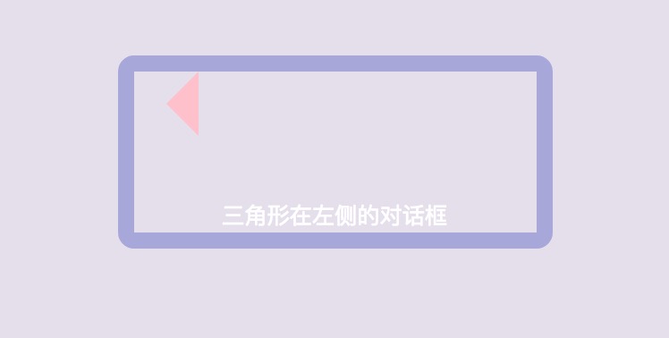
二、绘制三角形箭头A
然后我们绘制该气泡对话框的箭头三角形A
如何绘制三角形详情可以点击此处查看
①我们给矩形添加一个伪元素,在这个伪元素中绘制三角形A;
②由于此次我们绘制的三角形箭头在矩形框左侧,所以我们保留的是矩形左侧的边
CSS代码如下:
1 | .two:before { |
三、调整三角形箭头的位置
我们通过CSS定位(position)来移动三角形箭头A位置,将三角形移到矩形框的左侧。可以运用子绝父相的原理来进行定位。
①在三角形的父元素中添加相对定位;
②在伪元素中添加绝对定位。
CSS代码如下:
1 | .two { |
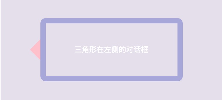
四、绘制三角形B
然后我们需要绘制一个颜色与矩形背景色相同的三角形B,添加伪元素after,在这个伪元素中绘制三角形B
CSS代码如下:
1 | .two:after { |
五、调整三角形B的位置
我们通过CSS定位(position)来移动三角形箭头B位置,用B三角形遮住A三角形的底边,只留两侧的边,这样三角形看起来就好像是描边的了。
CSS代码如下:
1 | .two:after { |

六、修改三角形颜色
最后,我们只需要将三角形箭头A的颜色修改为矩形框的边框颜色,将三角形B的颜色改为矩形框的背景色就可以啦~
下面附上完整代码:
1 |
|